Plain reds, pinks & purples
Showing 1–50 of 55 results
Plain red, pink and purple cement tiles bring a rare chromatic intensity, between passion and refinement. At Cimenterie de la Tour, we offer this bold palette, from powder pink to deep burgundy, in squares, hexagons, octagons, rectangles and diamonds. Below you will find all our plain red, pink and purple tiles, to create interiors with strong personality, between softness and character.










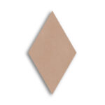
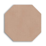
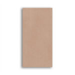
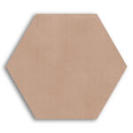

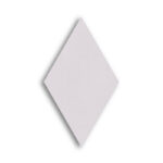
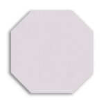
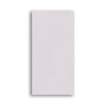
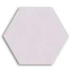

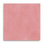

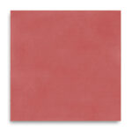

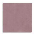

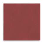

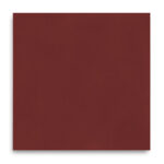

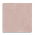

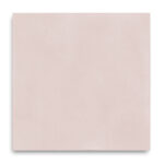

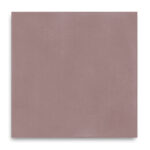





A palette with character, between softness and intensity
Some colours settle quietly into a room, while others immediately state an intention. Red, pink and purple belong to the second kind. Choosing a plain red, pink or purple cement tile means choosing an interior that embraces its singularity, far from all-purpose neutral palettes. It is an architect’s approach in the fullest sense: these shades do more than cover a floor, they compose an atmosphere and express a sensibility, that of an interior unafraid of colour that uses it as a true tool of spatial composition.
At Cimenterie de la Tour, every plain red, pink or purple cement tile is handmade using a centuries-old cold-pressing process that gives the material depth of colour and a slight variation from one tile to the next. This artisanal authenticity allows colours as bold as burgundy or aubergine to keep a mineral elegance, far from the sometimes garish shine of coloured industrial tiles.
From powder pink to deep red, a range full of nuance
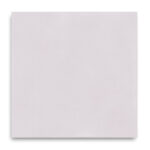
Our range opens with delicate shades such as pale pink and flesh pink, which bring an almost velvety softness to a room. On the floor of a bedroom or dressing room, a pale pink tile creates an intimate, enveloping atmosphere, particularly sought-after in contemporary interiors that dare to use colour subtly. Paired with off-white walls and light wood furniture, it creates a soft, bright atmosphere, far from the clichés of an overly sugary pink.
Red, in its boldest form, is a colour of absolute character. Laid across a kitchen or as a border around more neutral tiles, a red tile immediately catches the eye and becomes the focal point of the room. It is a shade worth daring on small surfaces, such as a pantry or utility room, where it brings unexpected energy without ever overwhelming the space.
Burgundy and wine red, deeper, evoke velvet and full-bodied wine. In a study or library, they create a hushed, sophisticated, almost theatrical atmosphere, particularly appreciated in Haussmann apartment renovations or projects seeking a confident elegance. These deep shades pair beautifully with brass, velvet and dark wood, for interiors that cultivate a refined art of entertaining.
Aubergine and purple, a singular mineral elegance
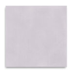
Aubergine and shades of purple, such as purplish sepia or pastel violet, hold a special place in our collection. These shades, halfway between mystery and sophistication, particularly suit projects seeking a strong, personal signature. An aubergine tile on a bathroom floor creates an enveloping, spa-like, almost nocturnal atmosphere, while a pastel violet adds a dreamy, gentle touch to a child’s bedroom or boudoir.
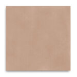
These purplish shades also work very well tone on tone with the pinks and burgundies in our range: pairing a pastel violet plain tile with a medium brownish pink creates subtle chromatic depth, an almost twilight gradient that brings great character to a large floor area.
Five shapes to enhance a bold colour
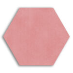
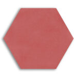
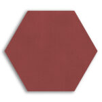
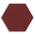
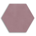
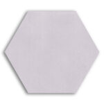
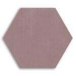
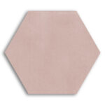
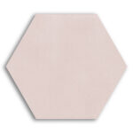
The richness of our red, pink and purple range also comes through five shapes available for every shade. The square, the historic cement tile format, is perfect for a continuous layout, particularly recommended for the boldest shades such as red or burgundy, where you want the colour to fully occupy the space without superfluous graphic effects. The hexagon, with its organic outline, softens an intense shade and works very well with powder pinks in a bathroom or bedroom.
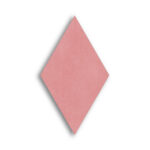
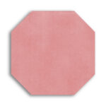
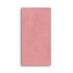
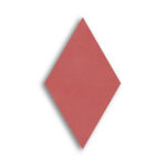
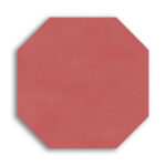
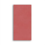
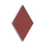
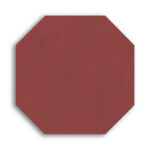
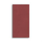
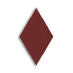
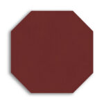
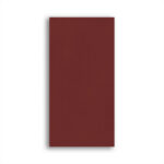
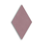
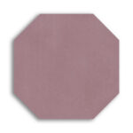
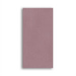
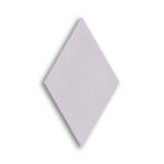
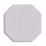
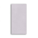
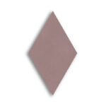
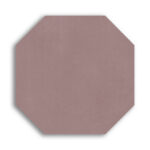
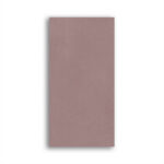
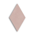
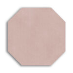
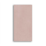
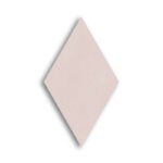
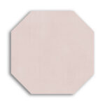
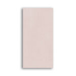
The octagon, often combined with a small contrasting tile at its intersection, tempers a strong colour such as aubergine by structuring it graphically, for an elegant, controlled result. The longer rectangle structures a hallway or entrance in red or burgundy without accentuating its visual intensity. Finally, the diamond brings a marked graphic dynamism, particularly sought-after for friezes or chevron compositions that enhance these characterful colours.
Creating a bold yet controlled atmosphere
Working with plain red, pink or purple cement tiles means choosing a resolutely personal atmosphere. The key often lies in balance: using a strong shade such as red or aubergine on a small surface, like a pantry or a cupboard entrance, lets you dare colour without risking visual overload. Conversely, a pale pink or pastel violet can cover a more generous surface, such as an entire bedroom, without ever becoming overwhelming.
These shades go particularly well with golden brass, velvet, veined marble and dark wood, for interiors that cultivate confident elegance and an extra touch of soul. They also find their place in more contemporary projects, paired with pure white and clean lines, for a striking graphic contrast.
Cimenterie de la Tour support, from idea to installation
Designing a floor in plain red, pink and purple cement tiles requires a careful eye for the balance of colour and how it interacts with the rest of the interior. Our team supports you at every stage: advice on combining shades and shapes, physical samples so you can judge the material in real conditions, and technical recommendations on the right installation for your project. Our showroom in Lavérune also lets you discover our projects in situ and talk directly with our advisers.
Whether you are considering a touch of colour or an entirely coloured floor, our range of plain red, pink and purple cement tiles gives you the raw material for a bold, refined and perfectly controlled interior. Feel free to contact us or request a quote to bring your project to life.


